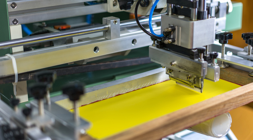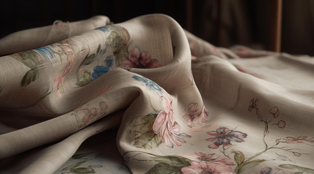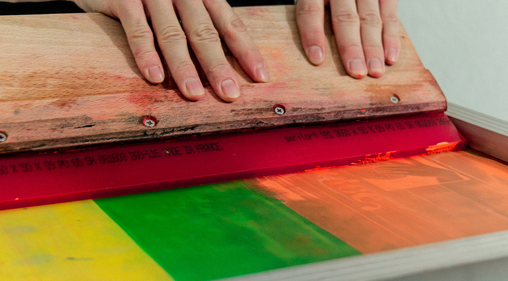
Fabric design with rotary screen printing represents a journey of exploring the psychological effects and meanings of colors. Colors evoke powerful and profound emotional responses in individuals. As a designer or artist, understanding these psychological effects is crucial to maximize the power of design and offer viewers a more profound experience.
There exists a rich history of color psychology, where each color carries a unique emotion or meaning. For instance, blue radiates feelings of calmness, trust, and tranquility, while red represents energy, passion, and excitement. Choosing the right colors on fabric with rotary screen printing can influence the emotional or symbolic message a design intends to convey.
This is a process that needs careful consideration depending on the purpose of the design, the target audience, and the context in which it will be used.
Color psychology is effective in various fields, from clothing design to interior decoration. Proper use of colors can make a design stand out, tell a meaningful story, and impact people mentally and emotionally. Color selection shapes the character of a collection or interior space, providing viewers or users with a memorable experience.
In conclusion, color psychology in fabric with rotary screen printing is crucial to enhance the depth and impact of design. By placing the emotional and symbolic meanings of colors at the center of the design process, designers can offer viewers or users a richer and more meaningful experience. Therefore, understanding the psychological effects of colors and using them appropriately in design processes becomes a fundamental skill for designers seeking to establish emotional connections and meaning in fabric design with rotary screen printing.


